Pages Menu
Categories Menu

Posted by on Aug 19, 2020 in Embossing, Faux Batik, Heat Embossing | 41 comments

Autumn Weather with the Inking Royalty

Welcome to the Inking Royalty’s August Blog Hop! During this year’s blog hops, we are enjoying a year of celebrations. This month’s projects celebrate Autumn Weather, so prepare yourself for projects that are filled with warm tones and beautiful nods to the upcoming change in weather. We are excited to share our creations with you today! After you read my post, I hope you’ll hop over to the next person on the list at the base of this post.

You guys know me well enough by now that you know I kinda take a different approach to the blog hop themes. This month is all about Autumn weather.   Fall is a beautiful time of year. We have football, pumpkins, apples, and leaves changing.  I’m sharing with you one of my favorite techniques that reminds me of leaf rubbings.  It doesn’t really look like leaf rubbings but, the technique is beautiful with leaf imagines. Something about the process completely reminded me of leaf rubbings.  I have not done Faux batik in a long time! So, it was definitely time to pull it out of the vault and play.

In thinking about which stamp set to use I landed upon the newish, Forever Fern stamp set. A few reasons why I chose this stamp set.  1. I have had the most success with the Faux Batik technique when using solid images.   2. This stamp set is beautiful!

Forever Fern

Forever Fern stamp set

This red rubber Distinktive style of stamp is so much fun to use!  I really love red rubber stamps and it really makes me happy that Stampin’ Up! has this awesome line of stamps

There are several steps to the Faux Batik technique.  Basically, you stamp the image on tissue paper with versa mark ink. Then heat emboss the image.  I often use metallic embossing powder. But, that is not necessary.  The next step is to use a baby wipe to add ink to the image as it is layered over shimmery white paper.  To see specific instructions please check out this post!

The card base is stamped using the Very Versital stamp set! I truly adore this stamp set! I always tend to overdo the grunge/ vintage look. As you can see above.  But, seriously, overdone it is still pretty

Very versatile

Very versatile stamp set

If you don’t have this beautiful stamp set you need it!  I used early espresso, mint macaron, and silver ink to create the background.  I also did a little sponging with Mango Melody   The thinking of you stamp was in my Very Versital stamp case. So, I really have no idea where it belongs. At the time I thought it was in the right place.

Each of your comments makes me smile! Please, comment HERE.

Thank you for stopping by today.  I hope you’ll hop along to the next stop on the blog hop, Jackie Beers at Blue Line Stamping There’s lots of inspiration to be found in this group – and you don’t want to miss it! If you get stuck during the Blog Hop, please use this line-up as a guide:

  1. Brian King at Stamp with Brian
  2. Sheryl Sharp at Sharp Notes by Sheryl
  3. Sue Jackson at Just Peachy Stamping
  4. Jennifer Spiller at Westside Paper Creations
  5. Jackie Beers at Blue Line Stamping
  6. Shawn de Oliveira at Shawn Stamps
  7. Rachel Brumley at Artistic Designs by Rachel
  8. Robbye Hamilton at Miss Hammie’s Crafts
  9. Candy Ford at Stamp Candy
  10. Lynn Kolcun at Avery’s Owlery
  11. Joanne Brown at Stamping with JoJo
  12. Sheryl Abernathy at Elegant Sentiments
  13. Robin Myren at Songbird Designs by Robin
  14. Linda Krueger at The Stamp Coach
  15. Pam Morris at Tap Tap Stamp
  16. Julie DiMatteo at The Paper Pixie
  17. Ann Murray at Murray Stamps Ink

I’m so glad you have taken the time to hop along with us today!  Please take the time to continue to hop along! I know everyone will have many beautiful autumn inspiration for you!  Remember to always find a moment in your day to be creative!

Peace my loves-

Jennifer

Read More

Posted by on Jun 4, 2018 in Birds and Blooms, Hand written, Happy Birthday, Heat Embossing, Heat Embossing, June 2018, Layering Ovals, Petal Palette, Petals and More, Silver Embossing Powder, Stampin' Blends | 2 comments

Stampin’ Blends

I love craft supplies!  I really enjoy trying different coloring methods.  That being said I also have a little sickness called “full set syndrome”  So, when I discover a new coloring medium I dive straight in having to have them all. When Stampin’ Up! introduced their new alcohol markers back during the winter, I was all in!  I loved the alcohol markers I owned (Prismacolor). And now I could have a similar marker with Stampin’ Up! exclusive colors!!! Um, Yes! PLEASE!  When I got these markers in my hand I was even more head over heals!!! The Stampin’ Blends are beyond amazing!

The Creative Way – A Product Feature, Stampin’ Blends

These amazing markers come in 13 amazing colors currently!  A light and dark of 11 Stampin’ Up! colors, ivory, and bronze. There is also a color lifer. The colors available now are, light and dark of each: Daffodil Delight, Old Olive, Cherry Cobbler, Night of Navy, Rich Razzleberry, Pumpkin Pie, Bermuda Bay, Crumb Cake, Smoky Slate, Pool Party, and Calypso Coral.   Very soon, there will be even more colors added! (Hopefully Mid June)

Stampin' Blends


Why do I love these markers so much? Because as the name suggests they have a amazing ability to blend together creating a smooth or compleat colored image with out harsh lines.  This is because of the alcohol in the markers.

When working with Stampin’ Blends you want to use an ink that will not bless when the alcohol touches it!  Stampin’ Up!  has a great in that is perfect for the Stampin’ Blends. This ink is Memento Tuxedo Black. There are other choices on the market.  But, Memento Tuxedo Black is a wonderful ink that you will enjoy using.

The paper you choose to work on will greatly determine the results of the project. Whisper White is a wonderful choice! The clay finish on the paper makes it wonderful to color on.  Shimmery White is also another choice.  The ink moves really well on Shimmery White Paper.  So, you have to be really careful when coloring close to the edges of images. Cause the color will bleed on this paper.  But, this is easy enough to fix with the color lifter. Another great choice is Glossy White. The blends become very bold on glossy white paper!  The blending effect is less and it is really easy to get dynamic colors.


Today I am show you two cards that have the same background. One is on shimmery white paper The second is one is on Glossy White. Hopefully you will be able to see the difference in the two papers. Both backgrounds were made by scribbling color in kinda rainbow order… The first color was the New Pineapple Punch (available Mid June), then Daffodil Delight light and dark, Calypso Coral light and dark, Cherry Cobbler light and dark, Lovely Lipstick (available Mid June), and Rich Razzleberry light and dark.  Each time a new color was added It was overlapped with the previous color. And if needed more of either overlapping color was added. This created the desired gradient look.  After the coloring was finished the background was spritzed with alcohol leaving water like spots. Also I Flicked ink from several of the markers over the background

Card

  • The background is shimmery white paper with a Stampin’ Blend gradient color pattern
  • The second step was to add the text from the new Handwritten Background stamp with white embossing powder
  • The next step was to heat emboss the edges of the paper
  • Then I picked two contrasting colors (to the background), Bermuda Bay and Granny Apple Green. For the bird and leaves

The stamp set used is Petal Palette along with the Birds and Blooms Thinlit Dies and Petals & More Thinlets Dies

Happy Birthday Card

  • This background is Stampin’ Blends on Glossy White Paper
  • The Happy Birthday was die cut in both Bermuda Bay and Granny Apple Green then sniped so that the Granny Apple Green Birthday could be glued on top of the happy Bi in Bermuda Bay
  • The silver oval is two layers of silver embossing powder. This give the oval a metal look

Hers a look at the two cards side by side! In this picture you can see the difference in the two backgrounds.  Remember the only difference in the process of making the backgrounds was the paper

Gradient background with Stampin' Blends

I really enjoyed making these easy backgrounds! I hope you will give this fun technique a try!

Each of your comments makes me smile! Please, comment HERE.

you can see day one of June’s The Creative Way here


The All New Catalog is available and ready for you to shop from.  You can shop online here

We had a good weekend in Birmingham celebrating with my cousin Cody and his Bride Karley! We are so happy for them!! I’m leaving you with a picture from that day!

Have a great Monday! Go and live creatively my friends!

Peace-

Jennifer

Read More

Posted by on May 15, 2018 in Big Shot, Black embossing powder, Heat Embossing, ink as watercolor, Lemon Lime Twist, Rooted In Nature, The Creative Way, The Creative Way -May 2018 | 5 comments

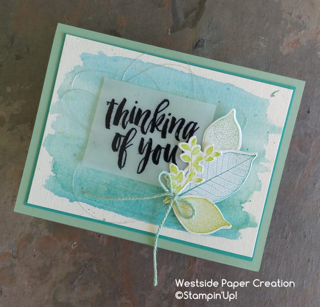
Rooted in Nature Thinking of You Card

Yesterday, I shared my version of a masculine card using the Rooted In Nature stamp set and Faux Batik technique. Today’s card is a softer more feminine card using a simple watercolor background and the same set! Thinking of you cards can be the hardest to make.  A soft watercolor wash seems to give a soothing fell along with a soothing color palette.

The Creative Way – A Product Feature – Rooted In Nature

This month for The Creative Way I am sharing projects made with the Rooted In Nature Stamp set!  This set will be available in June 2. I have so enjoyed working with the awesome stamp set.  Rooted In Nature is available as a Bundle which saves you 10%  The bundle includes coordinating dies!! How cool is that!!! You can join me Every Monday & Friday for The Creative Way – A Product Feature. Any yes, I know today is Tuesday!  It is a bonus day!  Yeppie!!!!

Nature

Rooted In Nature Bundle

I love watercolor backgrounds.  They are a quick way to add so much interest to a card!  Plus there’s like a million ways (techniques) that you can use to create fun watercolor backgrounds.  When I pull out watercolor supplies I normally end up making a bunch of backgrounds.  Mainly because I love the process of just sitting and trying different things till I’m content.  Also, it gives me a starting point for so many projects if I have a few watercolored papers hanging around. The other thing is watercolor always, always, always looks it’s worse right before it looks nice or pretty.  And wet always looks way worse than dry.  I can’t tell you how many prices of watercolor I have pulled out of the trash because I threw them away wet.  And once they were dry, I decided that’s not so horrible.  One of my favorite colors to use for watercolor is Tempting Turquoise (Retiring).  I just adore this color when it is combined with water! So, I wanted to make sure I used it on a card before it was gone!

Thinking of you card using Rooted In Nature

  • The watercolor was very simply done with ink refills and a aqua painter using Bermuda Bay and Tempting Turquoise
  • I worked Tempting Turquoise from one end to the middle. And Bermuda Bay from the other to the middle . Letting the two cross and blend.  This makes a very easy gradient wash.
  • After the initial color dried, I splattered Lemon Lime Twist on the background
  • The Leaves from Rooted In Nature were stamped in Lemon Lime Twist, Mint Macaroon, and Bermuda Bay. The die cut with the coordinating dies.
  • The Sentiment heat embossed with black embossing powder on vellum
  • The final step was to add some texture with the Sliver Thread and Nature’s Poem Twine (Mint Macaroon)

I love envelopes decorating! So I decided to add the leaves to the envelope!!!

Envelope decorated with Rooted In Nature Stamp Set

  • Using the same colors as the card, Bermuda Bay, Mint Macaroon, and Lemon Lime Twist the leaves were randomly stamped on the envelope flap
  • To protect the envelope front while stamping the flap, I used A piece of masking paper (Avery removable labels 6465)
  • The finishing touch was to add a few leaves to the front of the envelope

Thinking of you

Each of your comments makes me smile! Please, comment HERE.

  I hope you have enjoyed seeing this bonus card for The Creative Way!!  I have so enjoyed sharing Rooted In Nature with you! Also seriously, the Tempting Turquoise ink is amazing for watercolor!! If you like this look I highly suggest you purchase it now!!

The first post in The Creative Way  series shares a lot of my thoughts about the Rooted In Nature Stamp Set and the Nature’s Poem Suite that Rooted In Nature  is apart of! You can find that post here

For day 2! 

For Day 3!

For Day 4


The Share What You Love bundle is jammed packed of stamping wonderfulness for every card maker or paper craftier out there!!! This bundle is only available for a limited time

Share What You Love Bundle

  • Bundles are exclusive to the suite early release and will no longer be available after May 31, 2018. Individual items from the Share What You Love suite will be available when the 2018–2019 annual catalog is released on June 1, 2018.

If you would like to see Cards with this bundle click here and here


Lots of awesome products are retiring from the Occasions and Annual Catalogs .You defiantly don’t want to miss out on these fabulous items!!


Retiring Stampin' Up! Products


Have a great Tuesday!  As always if you have any questions about today’s card or any paper crafting project you have seen here at Westside Paper Creations feel free to contact me!  Tomorrow is the Inking Royalty Blog Hop!! So, I hope each of you will be back for that fun day!!  Go and live creatively my friends!

Peace-


Jennifer

Read More

Posted by on Feb 14, 2018 in annual catalog stamp sets 2017-2018, Copper Embossing Powder, Heat Embossing, Pal's Blog Hop | 7 comments

Vertical Greetings

Welcome to the Pals February 2018 Blog Hop. Our theme this month is “Case the Catty”. The Stampin’ Pretty Pals will copy or remake projects from any of the current Stampin’ Up! catalogs and brochures. After all, who doesn’t CASE (Copy and Share Everything) once in a while. You may be just starting or hopped over from another Pal. In either case you’ll find the line-up toward the end of my post to help you move along.

I was thinking about exactly what card I wanted to CASE. And decided on a card in the occasions catalog . I love the bright colors and the gradient look with the heat embossing!

In my interpretation of the card, I completely changed the colors.  I did used the technique with the blends to create my background . And the card was turned on its side . And instead of a white card base with a little texture added by stamping .I used the Tutti-Frutti notecards available during Sale-A-Bration .

I love these patterned notecards and envelopes!  I love even more that they are FREE with a $50 purchase.  Yeppie!!!!

  • The gradient background was created with Stampin’ Blends . I used Night of Navy, Bermuda Bay, and Pool Party. This technique is very easy to create .I just simply colored on Whisper White paper each color using the brush tip and overlapping the colors .
  • After the background was created, I stamped the flower-pot from Vertical Greetings with versamark. Then I heat embossed it with copper embossing powder.
  • The just because was heat embossed in while on Night of Navy card stock
  • The final touch was adding the Night of Navy and Calypso Coral Enamel Shapes

Each of your comments makes me smile! Please, comment HERE.

Thank you so much for hopping with the Stampin’ Pretty Pals today. Please take a minute to mark your calendar for our next hop on March 14, 2018. Now hop along using the Blog Hop Line-up below. Don’t forget to leave us a comment. We really like that.

  1. Mary Fish at Stampin’ Pretty
  2. Debbie Mageed at Secret Stamper
  3. Su Mohr at Aromas and Art
  4. Jennifer Michalski at Stamping Serenity
  5. Beth McCullough at Stamping Mom
  6. Rachael at Bluebonnet Stampin
  7. Lisa Ann Bernard at Queen B Creations
  8. Peggy Noe at Pretty Paper Cards
  9. Stesha Bloodhart at Stampin’ Hoot!
  10. Jackie Beers at BlueLineStamping
  11. Shannon Jaramillo at Shannon Kay Paperie
  12. Rosanne Mulhern at Heartfelt Stamping
  13. Jennifer Spiller at Westside Paper Creations
  14. Linda Suarez at All Night Stamping
  15. Pamela Sadler at Apron of Love
  16. Corinne Blake at The Creative Compendium
  17. Wendy Klein at DogGone Delightful Stampin’
  18. Julie DiMatteo at The Paper Pixie
  19. Tricia Chuba at ButterDish Designs
  20. Sara Hicks Stuart at Sentiments by Sara

Thanks for stopping by today! I hope you enjoy all the creations during the blog hop! Go and be creative my friends

Hugs-
Jennifer

Read More

Posted by on Sep 10, 2017 in Big Shot, Embossing, Heat Embossing, Oh my stars, Season of Whimsy | 6 comments

Happy New Year

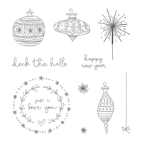
The host set in the Holiday Catalog is such a fun whimsical set! I love the sketched feel of the set. I love that the ornaments are perfect for coloring. I love the simplicity of the sentiments and the stamps.

Season of Whimsy

The Other is always wanting new years cards.  So, I decided to make a few using the sparkler! It is just too much fun!

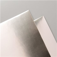
  • The colors used are Pool Party, Powder Pink, and Champagne Foil
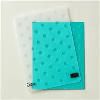
  • The Champagne Foil is beautiful embossed. Here it is embossed with the Oh My Stars Embossing Folder
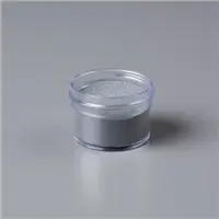
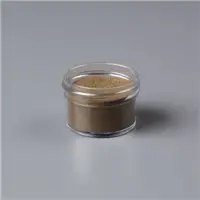
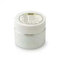
  • The sparkler is heat embossed. I wanted something similar to the Champagne Foil and something shimmery. So I took silver embossing powder and added a little gold, a little copper, and some dazzling diamonds. Shook it all up for a unique color.
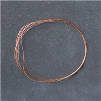
  • The final touch was to add some copper thread. I’m a huge fan of the mixed metal look. The Champagne Foil lends itself to this look quite well

A note about the Champagne Foil it is not this gold looking in real life. Unfortunately, even after trying several time of day, the foil photographed quite gold looking.

Here’s a up close of the mixed embossing powders

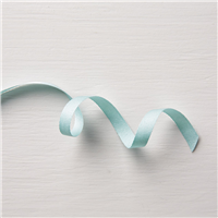
The card base in a Whisper White Notecard & Envelope.  The Pool Party layer is 4 7/8 by 3 3/8 inches. The Champagne Foil is 4 3/4 by 3 1/4 inches and embossed. The small Pool Party layer is 3 5/8 by 2 1/8 inches.  The stamped layer is 3 1/2 by 2 inches. The ribbons used are Powder Pink shimmery ribbon and Soft Sky classic weave ribbon.

[Comment]

The Holiday Catalog is here! I adore this catalog! I know you are loving it as much as I am! It is just full of awesomeness!!!

There is a super exciting stamp set available to all who place $300 order during September and October. Host a party or gather orders from your friends to reach your $300 order! You are going to want this exclusive stamp set! It is amazing!

Here is the supply list.  If you have any questions about today’s card, products used, or Stampin’ Up! feel free to email me at westsidepapercreations@gmail.com


Price: $110.00

Supply List

 I’m very happy to be sharing with you on this Beautiful Sunday.  My thoughts are with all my Florida Friends as they are with my Texas Friend now in the stages of recovery.
Peace my Friend-
Jennifer

Read More