Pages Menu
Categories Menu

Posted by on Aug 19, 2017 in Berry Burst, Heat Embossing, InColors 2017, Lemon Lime Twist, Lift Me Up, Silver Embossing Powder, Thoughtful Banners, Touches of Texture, Up & Away | 4 comments

Take 2 with #GDP1000

The Global Design Project is celebrating their 100th challenge!!! How fun is that. Earlier this week I cased the fabulous, Brin King.  You can see my card here.  Today, I am caseing my friend Shawn DeOliveira.  Shawn and I officially met last year at World Card Making Day in Atlanta!  Though we know each other in the cyber world much longer.  So, I knew I had to CASE his awesome card for the Global Design Project 100th Challenge!

I love this card so much! The colors are awesome! The use of metallic is just perfect! One think that always impresses me about Shawn’s cards is the graphic feel they have.  That, and how he uses ribbon is beyond amazing!

Here’s the banner for Global Design Project. I hope you all will hop over to see the design team’s cards for this very special challenge!

I wanted to use metallic, like Shawn did! I also wanted to case his card design.  I love the clean and beautiful feel his card had.  I loved the texture of the background so, I wanted to case that as well.  That gave me a starting place…Matallics, design, and texture!!!

So the only thing let to decide on was the stamp set!

I decided on Lift Me Up! Mainly because, I thought the dies and stamped balloons would work as a focal point. Much like the sentiment, vellum, and ribbon all draw the eye to a certain point on Shawn’s card.  And, well, I love this set! And I had not used it recently.  So, it was time to dust it of…

Lift Me Up Stamp Set

I love how cute this stamp set is! And it is even better that the stamp set and coordinating dies work together to make verity of balloons.  What fun!!!

  • I decided for the metallic I would use the Foil Frenzy Designer Series Paper paired with silver foil.  What a fun combination! Lemon Lime Twist and Berry Burst complete the color combination
  • For the texture I added silver embossing with the touches of texture stamp set. This was added to the Berry Burst background and to the large balloon
  • The sentiment is outlined with a banner border from Thoughful Banners.  Look how wonderfully the sentiment fits right in there!

Each of your comments makes me smile! Please, comment HERE.

A new live class registration is open.  We will be using the Coffee Cafe’ and Merry Cafe’ stamp sets! The class is August 26th from 1-3 at Westside  Coffee Place & Café

Sign Up now!

The Holiday Catalog goes live on September 1st!! If you would like a copy just let me know via email. I will be happy to send you one!

The Carols of Christmas Early Release is now available for you to purchase. You are going to love this set so much. It is my must have from the Holiday Catalog. It is amazing!!! So very easy to use and just simply perfect!!! It will remind you of why you love stamping in the first place. The stamp set pairs with the Card front builder dies! These dies rock!!!! They will make every Holiday Card sing in glory!!!!

There is a Paper Pumpkin sale going on and it is pretty sweet! This is definitely the time to join!!!

Here is the supply list.  If you have any questions about today’s card, products used, or Stampin’ Up! feel free to email me at westsidepapercreations@gmail.com


Price: $110.00

Jennifer

Read More

Posted by on Aug 18, 2017 in Beachy Little Christmas, Faux Ripped Edge technique, Heat Embossing, Silver Embossing Powder | 15 comments

Faux Riped Edge CASE….

One of the things I love most about the stamping community is how open everyone is  to sharing ideas and techniques.  There is a little thing called CASE which stands for copy and share everything!  We all pull ideas from each other.  I love that ❤…

Recently while scrolling through Facebook, I saw a super cool technique called Faux Ripped Edge. I knew right away I had to try it.  The person showing the technique was Patty Bennett! She is awesome by the way.  And has several cards on her blog showing this technique.

One of Patty’s cards is a beach scene. Which I had to CASE!!! I changed up the stamp set and s few colors. But, you can defiantly see Patty’s  beach scene in my card.  See Patty Bennett’s card here and a great video of the technique

I know from the moment I saw the holiday catalog I had to have Beachy Little Christmas.  This cite stamp set has everything you need to make fun beach themed Christmas Cards

Beachy Little Christmas

That palm tree with the lights is the cutest thing ever!!! And the hut is so adorable! But, my favorite image is the crab with the holly. How adorable

I love this card from the Holiday Catalog! It is super cute and shows all the fun ways to use the stamp set!!

  • I used three different coloring techniques.  The Faux Ripped Edge Technique, my Stampin’ Wright Markers (and a blender pen), and ink blending with a sponge brayer and sponge dabber
  • The Ripped Edge  technique uses glossy paper. Witch is quite different from working with whisper white or even shimmery white.  The ink sits on top of the paper and then slowly absorbs into the paper. So it my take you a few times to get it down right!
  • To do this technique you rip paper and use the edge as a guide to add ink directly from the ink pad to the glossy paper. I used Pool Party, Tranquil Tide, and Sahara Sand
  • The background is silver embossing with ink blended on top.
  • The last detail is the star and ribbon.  The star is from the Year of Cheer embellishments
  • The colors used were Real Red, Tempting Turquoise, Sahara Sand and Wild Wasabi. There is a little Smoky Slate on the hut.  Can you see it???

Each of your comments makes me smile! Please, comment HERE.

This square card is 5 1/2 by 5 1/2 inches. The card base is Tempting Turquoise paper that is cut to be 5 1/2 by 11 inches. Then  score and burnish  at 5 1/2 inches on the 11 inch side. The layers are Real Red 5 1/4 by 5 1/4 inches, the wild wasabi layer 5 1/8 by 5 1\8 inches, the tilted Tempting Turquoise 4 1/4 by 4 1/4 inches, tilted Real Red 4 1/16 by 4 1/16 inches, the glossy white paper is 4 by 4 inches.

Here is a up close of the embossed layer!

I have a new class registration  open.  We will be using the Coffee Cafe’ and Merry Cafe’ stamp sets! The class is August 26th from 1-3 at Westside  Coffee Place & Café

Sign Up now!

The Holiday Catalog goes live on September 1st!! If you would like a copy just let me know via email. I will be happy to send you one!  The Beachy Little Christmas is such a fun twist on the Holidays!

The Carols of Christmas Early Release is now available for you to purchase. You are going to love this set so much. It is my must have from the Holiday Catalog. It is amazing!!! So very easy to use and just simply perfect!!! It will remind you of why you love stamping in the first place. The stamp set pairs with the Card front builder dies! These dies rock!!!! They will make every Holiday Card sing in glory!!!!

There is a Paper Pumpkin sale going on and it is pretty sweet! This is definitely the time to join!!!

Below is a list of products used while maki this card! If you have any questions, feel free to email me at westsidepapercreations@gmail.com


Happy Friday my friends! We have almost made it to another weekend! Yeeppie!!!!

Peace-

Jennifer

Read More

Posted by on Aug 17, 2017 in Aqua Painters, Big Shot, Copper Embossing Powder, Global Design Project, Heat Embossing, InColors 2017, ink as watercolor, Pick a Pumpkin Bundle, Tranquil Tide, watercolor, Watercolor | 11 comments

Happy 100 to Global Design Project #gdp100

The Global  Design  Project  is celebrating  there 100th challenge!  I remember  how excited  I was when this challenge  started!  I was even more excited  to participate  in that very first challenge. Now, 100 challenges later we are all celebrating the designers.

Each designer designed a card.  Those of  us playing along, are picking a designer to case.  What fun! For today’s  card I picked my friend,  Brian  King! His clean line card is amazing. I love the pop of gold he used!!!

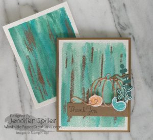
I love  the clean lines with the marbled background!  And the bold focal point is awesome!

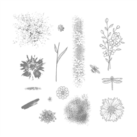
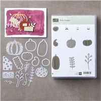
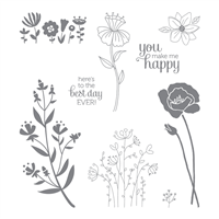
I knew that I wanted to use a metallic as part of my focal point.  So, while thinking about what stamped I wanted to use I also thought  about what would look awesome  in metallic. I decided on a new stamp bundle in the  upcoming  Holiday  Catalog  (available  September 1) Pick a Pumpkin bundle is beautiful  and has a pumpkin in the dies I know  I wanted to guild! Perfect!

Pick A Pumpkin Bundle

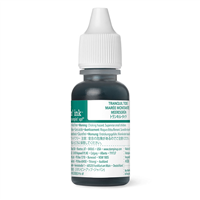
I wanted  a basic  background  that would allow  the pumpkins and gourd to shine.  I went to my default  background  technique, and ,adequate a watercolor background!  I sed the ink refill for the watercolor.  Initially, I was just going to use two colors and make a soft background.  But, the watercolor  had something else in mind.  I love how the unexpected  addition  of Tempting  Turquoise is to this Pool Party and Tranquil Tide background.

Pool Party
Tranquil Tide
Tempting Turquoise

I have several pictures to share with you today .  They will show you the process  I used in making my watercolor  background.


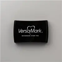
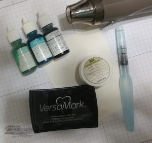
The first step is to gather the supplies up that our will need!  You will need watercolor  paper, ink refills o your  choice, a aqua painter, versamark ink, a heat tool, and embossing powder.  I also used a clip board and some  painters tape.

Let’s talk  just a second about watercolor  paper. Watercolor  paper comes in three forms normally.  hot press, cold press, and rough.  Stampin’ Up! watercolor paper is cold press paper.  For this particular project I wanted a paper that had more tooth.  So, I pulled  out  some rough paper.  I am addicted  to watercolor  paper and use all three types.   Hot press is awesome for stamping because  it has a smother  surface  than the other two.  You  could make this card with Stampin’ Up! watercolor paper without any problem

The first thing I did was to tape off a border on the watercolor  paper. I used my grid paper to help lign it up straight. I did not really press down my tape  to the grid paper because,  I transferred the whole thing over to a clip board.

The next step  was to use my aqua painter to add water to the paper.

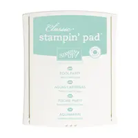
The next step, is to start adding color! I started off with Pool Party. I added a few drops of ink and water to a flat dish. Using  a aqua painter, I  added the color. I started with up and down strokes. Then dropped  in color in a few spots

At this point, I used my heat tool to dry the paper.  After each addition of color the paper was dried with a heat tool.  This added some harsh  lines between layers of color

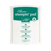
The second  layer of color was Pool Party and Tranquil Tide.  The color was added in the same fashion.   By starting with up and down strokes, them dropping  in color.

Again,  I heat set the panel adding definition between  layers of color.

The final watercolor step was to add Tempting Turquoise  ink and Pool Party ink.  This layer was added with almost  a dry brush.  Again, using an up and down motion with the Tempting Turquoise.  Then I added a little  more water to my brush and added Pool Party ink.

Watercolor always looks it’s worst right before it looks good. So keep going and practice.  Practice is key in learning how watercolor works.  The final step is to heat set the watercolor  one last time. Carefully,  remove the tape.

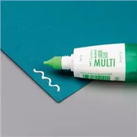
After the watercolor panel is dry, it is time to add the copper  embossing.  To do this you will need embossing power,  versamark ink, and a heat tool

I used the edge of the versamark ink pad to add inkto the paper.  Then added the embossing powder.

At this point my embossing looked quite messy.  So, I  used a paint brush to swipe away any unwanted embossing powder.  Then used my heat tool to set the embossing.

I love the final results! The copper really adds a fun fall feel to the background.   It also brings in the copper guiding flakes used on the pumpkin.

I love to watercolor and don’t get the chance to use the rough paper very often.  I love the results of the inks on this paper.  The difference  in color  between  this panel  and the one on the card is that this one turned out darker.  That’s because,  I used less water in my ink dishes.  Also, no two watercolor panels will ever come out exactly  the same.

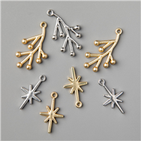
  • The images were stamped and die cut out. The small pumpkin in Peakaboo Peach. The gourd  in Bermuda bay.  The fun leafy flower thing in Tranquil Tide on Pool Party  paper.  The large leaf stem is die cut with Tranquil Tide paper. The small curly q is die cut with soft  suede paper
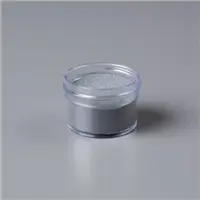
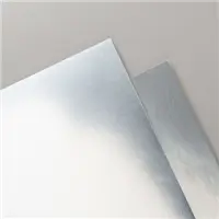
  • The large pumpkin is die cut out and has gilding added to it.  I used mostly copper. But, there is a little silver and gold also. I used whisper white paper and added the new adhesive sheets to both sides.  Then cut out the die. And added the leafing to one side.  The same process was used  for the large curly q
  • The card base is Soft Suede with a copper layer on top
  • The final steps was to decorate the envelope!

[Comment]

Thank you for sticking with me through so many pictures! I know it was a lot, but I really wanted to share with you my process.  Hugs to you who stuck around!!!

Below os a list of products used. If you have any questions about Stampin’ Up!, products used, or today’s card feel free to contact me via email at westsidepapercreations@gmail.com


Price: $110.00

I have a new class registration  open.  We will be using the Coffee Cafe’ and Merry Cafe’ stamp sets! The class is August 26th from 1-3 at Westside  Coffee Place & Café

Sign Up now!

The Holiday Catalog goes live on September 1st!! If you would like a copy just let me know via email. I will be happy to send you one!  The Pick a Pumpkin  bundle will no doubt be popular for fall crafting.  And because  it’s a bundle, you save 10% YEPPIE.

The Carols of Christmas Early Release is now available for you to purchase. You are going to love this set so much. It is my must have from the Holiday Catalog. It is amazing!!! So very easy to use and just simply perfect!!! It will remind you of why you love stamping in the first place. The stamp set pairs with the Card front builder dies! These dies rock!!!! They will make every Holiday Card sing in glory!!!!

There is a Paper Pumpkin sale going on and it is pretty sweet! This is definitely the time to join!!!

Follow my blog with Bloglovin

Won’t you join me in celebrating Global Design Project 100th challenge!!!! I hop hope each of you have an awesome day! Let’s all be creative  every day and share it with those around us! And just incase you are wondering who won the very first Global Design Project Challenge,  you can check it out here!

Peace-

Jennifer

Read More

Posted by on Aug 12, 2017 in Happy Birthday Gorgeous, Heat Embossing, Message in a Bottle, Playful Backgrounds, Silver Embossing Powder | 0 comments

Message in a Bottle…

This week has been full of excitement! Everything from being picked as a Team Choice over at the Tic Tac Toe Challenge!!! Yeppie! You can see my card here and the other chice designers here.  

The Pal’s blog hop was Wednesday! This day is always fun and full of inspiration! If you missed the hop.  Check it out here!!!

And then yesterday I was Guest Designer on Brian’s blog at Stamp with Brian. I was super honored  to share a cool technique with his readers.

Today I am sharing with you a card that was made from a piece of tissue after doing the Faux Batik technique.  If you would like to see the Batik card you can click here.

I really wanted to use the circles for a water scene.  The obvious choice was, Magical Mermaid.  But, I wanted to try something different!  Therefor I went with Message in a Bottle.

Message in a Bottle

This is one of the most adorable stamp sets ever!!! I have been in love with it ever sence my friend Shawn made a card with it! He used the octopus and the message “you octopi my thoughts” . How precious and adorable is that.  Anyway, I have wanted to use this stamp set ever sence.  So, today is the perfect opportunity!!!

  •  The background is Playful Backgrounds stamped on tissue paper and heat embossed with silver embossing powder
  • The colors used for the background are Pool Party, Bermuda Bay,  and Tranquil Tide
  • Then I added ink to it using the Faux Batik technique.  Instead of discarding the tissue paper. I let it dry and made this background.
  • After the tissue is dry,  I mixed multipurpose glue a little water. Painted it onto a piece of cardstock.  Then added the tissue on top.
  • The bottle is stamped in Basic Black., the water in Pool Party, and the whale in Basic Gray
  • The sentiment is stamped inside the classic label in the Happy Birthday Georgius stamp set . Then punched with the classic label punch
  • It is hard to see in the card, but, I added a little silver thread and some metallic enamel dots

The card base is Daffodil Delight with Basic Gray layered on top!

Here is a close up of the water bubbles and the bottle!

Each of your comments makes me smile! Please, comment HERE.

The Carols of Christmas Early Release is now available for you to purchase. You are going to love this set so much. It is my must have from the Holiday Catalog. It is amazing!!! So very easy to use and just simply perfect!!! It will remind you of why you love stamping in the first place. The stamp set pairs with the Card front builder dies! These dies rock!!!! They will make every Holiday Card sing in glory!!!!

There is a Paper Pumpkin sale going on and it is pretty sweet! This is definitely the time to join!!!

Here is a list of items used to make this card. If you have any questions about this card feel free to contact me at westsidepapercreations@gmail.com


Supply List

 Thanks for stopping by! I have really enjoyed sharing with you guys this week! I hope each of you have a awesome weekend!!! Let’s all find a little time to be creative and shre what we love with others!!!
Peace my friends-

Jennifer

Read More

Posted by on Aug 11, 2017 in Embossing, Faux Batik, Flirty Flowers, Heat Embossing, Silver Embossing Powder, Wood Plank Texture Impressions Embossing Folder | 54 comments

Faux Batik with the Flirty Flowers Stamp Set!

I have had so much fun playing with the Faux Batik technique over the past couple of weeks.  And,  I’m so very excited to show you how to achieve beautiful Batik with stamped images.  My friend, and Inking Royalty Team Leader, Brian King invited me to be a Guest Stamper on his blog.  Thank You Brian, for this awesome opportunity!!!   I am truly honored to be a Guest on your blog and apart of the Inking Royalty.  And Thank you to all of those who have hopped over from his blog to see more detail about the Faux Batik process.

Batik is a wax resist that is used for fabric dyeing.  The process of Batik can also be used in other mediums, such as rice paper watercolor.  I fallow a lot of artist on Instagram. It is one of the places that I go to for inspiration.  One of the artist, Emily Jeffords, that I fallow has been doing a lot with Batik and painting.  Her batiks are amazing.  And made me want to try to make something similar for cards.

For the Faux Batik technique, I have found that it works best with stamped images that are more solid.  Verses ones that have lots of details or are sketchy looking.   Batiking is a very organic looking process.  There for flowers and leaves are really beautiful with the Faux batik.  The Flirty Flowers stamp set is just perfect.

This stamp set is so happy and the flowers have such a fresh feel.

Today,  I am sharing details for the Faux Batik techniques with you.  Also, at the bottom of the post is a video if you would like to see the technique in action.  If you have any questions about the technique  feel free to email me at westsidepapercreations@gmail.com  If you would like to see other cards featuring this technique click here and here

The first step is to gather up the supplies that you will need.   This includes tissue paper, shimmery white cardstock, versamark ink, embossing powder, embossing buddy, heat tool, inks of your choice, stamps, and baby wipes

After you have gathered up your supplies, the next step is to heat emboss a stamped image onto the tissue paper.  To do this you will need your versamark ink, embossing powder, embossing buddy,  and heat tool.  Be sure to use the embossing buddy first.  This will help keep stray embossing powder form sticking in unwanted areas.  After using the embossing buddy, you want to stamp the image with versamark, add the embossing powder, pour off any access powder, and heat set the image.

After you have the tissue paper embossed.  It is time to make a Batik image!! To do this you need to place the tissue paper over the  shimmery white card stock.


The next step is to start adding ink to the tissue paper with a baby wipe.  I work from lightest color to darkest color.  In this case Pool Party was the first color added .

This is what is should look simular to after adding the first color

Then, Pear Pizzazz

and Finally, Old Olive.

After adding the Old Olive ink.  You can go back to your lightest color and add more if you like.  The final step is to remove the tissue paper to reveal your Faux Batik

You can use your tissue paper more than once if you are using the same colors.  Also, do not throw your tissue paper away.  You can use this for another card showing off the pretty embossing.   I used silver embossing  powder for my card.  And I am planning a second card that uses the tissue paper layer.  I love the look of the metallic embossing powders with the ink around them.  Also, this technique works very well on Whisper White Card Stock.

When using a bold technique, like this Faux Batik, it is best to keep the rest of the card quite simple.  This allows for your handy work to shine.


  • After the Faux Batik has dried it is time to add a sentiment.  I chose one from the upcoming Holiday Catalog. This sentiment is in the Painted Harvest stamp set (available Sep 1) .  It is stamped in Early Espresso ink
  • The background is the pinewood Plank texture impression embossing folder.  Use the folder to emboss Early Espresso cardstock.  After embossing, I added some gold leafing to the texture.  This give it a shimmery weathered look.
  • The only thing left is to  put the card together and pop up the Faux Batik

This card is a standard A2 card (4 1/4 by 5 1/2) . The card base is made from a 8 1/2 by 11 Early Espresso cardstock cut in half at 5 1/2 inches on the 11 side and scored at 4 1/4 inches.  Each layer is as follows.   Pear Pizzazz 4 1/8 by 5 3/8 inches.  Early Espresso 4 by 5 1/4 inches and embossed with the pinewood planks embossing folder. Pear Pizzazz 3 1/4 by 4 5/8 inches .  Shimmery White with Faux Batik 3 1/8 by 4 1/2 inches

Each of your comments makes me smile! Please, comment HERE.

The Carols of Christmas Early Release is now available for you to purchase. You are going to love this set so much. It is my must have from the Holiday Catalog. It is amazing!!! So very easy to use and just simply perfect!!! It will remind you of why you love stamping in the first place. The stamp set pairs with the Card front builder dies! These dies rock!!!! They will make every Holiday Card sing in glory!!!!


Price: $110.00

Thank you for stopping by!! I so enjoyed sharing this fun technique with you!! I hope each of you have a fablous Friday!! And that you have a moment to be creative and share your creative flow with others!!

Peace & Happiness-

Jennifer

Read More